Visual aids: the what, the when and the how
| Strona: | Poznan University of Technology |
| Kurs: | Unit 8: Visual aids |
| Książka: | Visual aids: the what, the when and the how |
| Wydrukowane przez użytkownika: | Gość |
| Data: | poniedziałek, 2 lutego 2026, 15:54 |
1. Main Types of Visual Aids
Now, let us look at different types of visual aids. We can generally divide these into three groups:
-
Graphic
aids:
charts, graphs (line graphs, bar graphs, circle graphs/pie charts, organizational
charts, and flow charts), chalkboards, posters, flip charts, pictures, drawings
and sketches. Charts and graphs are most often used to show numerical data.
When incorporating them into your speech, be sure to double check your numbers.
Moreover, tables and charts should always be discussed when you show them. The
discussion can be short, but do not assume that your audience will pay
attention to the aid or see the significant data in it. You must provide the explanation. Flip charts are practical when you
are presenting to a smaller group and you want to be able to change or modify
things as you go. Remember to write clearly, not too much on one page.
Here are some examples:
Fig. 1 A bar graph (adapted from Szczuka-Dorna, Vendome)
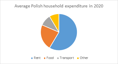
Fig. 2 A Circle graph (pie chart)
-
Three-dimensional aids: full-scale objects or models. These are
basically anything that you care to bring with you to show to your audience,
from small-scale objects to models of large buildings, for example. Again, you
should make sure the objects you present will be visible to the audience, and
really enhance your presentation.
- Projected aids: such as PowerPoint, Keynote (for Mac), Prezi and Google Slides. In the group we must also include separate audio and video recordings that are played to the audience, and which should not be longer than 30 seconds.As presentation software has become very popular for all kinds of speeches, you need to be aware of its shortcomings. Many speakers seem to think that just producing a number of computer-generated slides will create the effect they want. They do not realize that showing the slides one after another and then speaking is the worst possible method to use the software. Instead of enhancing or emphasizing certain points in your speech, the slides take over. The form becomes more important than the content, and the speaker loses contact with the audience, as everybody just follows the slides. The slides should only be used to show something that cannot really be described in any other way! They cannot become a substitution for a speech, or a way to fill in the time.
2. When and How to Use Visual Aids
If you decide to use a presentation tool, remember the following:
- Only use a little text on each slide, written in a simple style and in a large font, making sure the background makes it visible
- Do not use too many bullet points on one page (if you have to use bullets at all)
- Check your spelling
- Use high resolution photos
- When you present the slides, make sure you talk about something your audience can actually see
- Do not talk to the slides, talk to your audience!
When you are ready to illustrate your speech with some visual aids, choose them carefully. Here are some questions to consider:
- Do you want them to add extra information?
- Do you want to illustrate a certain point?
- Do you want to just maximize the impact you are aiming for?
3. Points to Consider when Choosing Aids
Sometimes the choice of your visual aids will depend on what facilities you will have at your disposal at the presentation venue. Will there be a microphone and speakers? Or perhaps there is only a blackboard on the wall? It is good to know the answers to such questions beforehand so that you do not invest in some high quality software that cannot really be used.
If you want to distribute handouts you should consider how much information you are willing to share and when to distribute them. Do you need them in the middle of your speech? Will you share them at that particular moment? Or do you perhaps want to leave the audience with a summary of what you have said, and therefore you will distribute them at the end of your presentation? Remember that from the moment you distribute handouts, they will create a distraction.
All visual aids have to be large enough, simple to understand and clearly visible (do not stand in front of them!). Choose simple, self-explanatory pictures, simple fonts for texts and avoid complicated multiple effects. Remember to acknowledge your sources when showing visual aids (you can print the source on the picture or at the bottom of the slide).